
Bellingcat est un groupe international indépendant de chercheurs, d’enquêteurs et de journalistes citoyens utilisant à la fois enquêtes open source et réseaux sociaux
▷ BELLINGCAT FRANÇAIS
07.07.2026 à 00:19
Bellingcat has geolocated footage circulating on social media that appears to show coffins placed in newly dug trenches following the recent deadly earthquakes in Venezuela. The site identified extends over two hectares beside an existing cemetery in La Esperanza, a town near La Guaira on the country’s northern coast. It was visited by a representative of […]
The post Between Graves and Uncertainty: The Management of the Dead After Venezuela’s Earthquake appeared first on bellingcat.
Texte intégral (3657 mots)
Bellingcat has geolocated footage circulating on social media that appears to show coffins placed in newly dug trenches following the recent deadly earthquakes in Venezuela.
The site identified extends over two hectares beside an existing cemetery in La Esperanza, a town near La Guaira on the country’s northern coast.
It was visited by a representative of our Latin American reporting partners who captured pictures of work ongoing at the site. They also report speaking to a resident who said that refrigerated trucks with several bodies had been coming and going.

The location matches a site identified in July 6 reports by AFP and Deutsche Welle (DW), which detailed that 150 unidentified bodies had been buried in a long row of individual graves.
AFP and DW published pictures of individual crosses and stones, quoting a resident of the town who stated that the burials were “numbered by plots and also by the code” so they could be identified at a later date.
It is not known if the coffins visible in the social media footage relate to the 150 unidentified bodies later referred to by AFP and DW, or if they are separate burials at the same general location.
Reuters also published pictures of the site on July 6 and showed video of coffins arriving on the back of flat bed trucks.

More than 3,500 people are confirmed to have died as a result of the earthquakes so far. But that figure is expected to rise significantly, with the UN reporting that the death toll could reach 10,000.
Oran Finegan, Director of Forensic Action International and former Head of Forensics for the International Committee of the Red Cross (ICRC), told Bellingcat that, while it is best practice for the burial of deceased persons to take place in individual graves, it is not uncommon to see long trenches like those seen in the social media footage when there are high numbers of unidentified deceased and it is not practical to immediately provide individual graves.

Support Bellingcat
Your donations directly contribute to our ability to publish groundbreaking investigations and uncover wrongdoing around the world.
He pointed to documentation from the ICRC that details best practices in such circumstances. He also made the important distinction between common graves, where bodies are temporarily kept until identification can take place, and mass graves, where bodies are dumped clandestinely without any care or process. What is seen in the footage appears to be the former, he said. There has been no evidence of the latter.
Finegan emphasised that it was vital that burials were mapped and recorded properly during any burial process so that identification could take place at a later date. Documenting where bodies were coming from, laying each body with enough distance from each other and ensuring each coffin or body bag had a unique number was key, he said.
While it has not been possible to ascertain the exact processes being followed at or preceding burials at the La Esperanza site, media reports in nearby La Guaira have recorded complications with identification and burial processes.
According to the BBC the scale of the disaster has overwhelmed local services, forcing institutions to improvise. Some bodies were being placed outside, exposed to the sun, at a port facility in La Guaira, the BBC reported.
A further complication is that many of the bodies recovered have reportedly been unrecognisable.
One woman told the independent Venezuelan publication RunRun.es that she was sent a tag and number for a body bag that did not match the bodies of her relatives. She was then told that her relatives’ bodies had been misidentified and sent for burial at a site in the town of Los Teques.
The New York Times reported last week that overwhelmed morgues were filling with unidentified bodies, forcing authorities to consider mass burials.
The Venezuelan Attorney General’s Office, the Judicial Police and National Service of Forensic Medicine Sciences did not respond to requests for comment for this article. However, President Delcy Rodriguez has previously stated that all bodies are being processed through a forensic identification system which includes fingerprints records, photographic documentation and forensic odontology.
Rodríguez has also said that “no one will go to a mass grave”.
The President of the Venezuelan Professional Funeral Sector Association (Asoproinfu), Davenio Velásquez, stated that there is a protocol for unidentified bodies to be buried temporarily in “five hundred individual burial niches” in Caracas. He added that they will be exhumed and cremated after six months if not identified.
Finegan added that exhuming and cremating bodies prevents identification and it is not a best practice. However, he said it is important to understand local cultural and religious customs. He also added that the six-month deadline for reclaiming remains is likely unrealistically short for such a major disaster.
Identifying the Burial Site
Terrain features in the social media videos Bellingcat found are consistent with those seen beside a graveyard on the outskirts of La Esperanza, a town situated on Venezuela’s northwest coast near the La Guaira region that was significantly impacted by the earthquakes.
These features allowed us to geolocate the site seen in the footage.
Firstly, a video published on Facebook on July 1 by Colombian digital outlet RTV appears to show a large grave with approximately half a dozen coffins situated within it. The video (which we will refer to as Video 1) further shows a group of people in civilian clothes beside a truck with more coffins on the back. It was not possible to verify the contents of the coffins.
Another video (which we will refer to as Video 2) posted to Instagram by an independent creator who said it was shared by a source on the ground also shows a series of large holes on a plot of land that appears similar to the first video.

Bellingcat sought to identify where these videos were taken by first searching for any other potential reference images and footage we could compare them to.
We found one video posted by a former army Colonel and now Mayor of Vargas Municipality, José Manuel Suárez Maldonado, posing beside heavy machinery as it prepared a plot of land that was due to be given to the local community as a new cemetery plot. The video was first published in June 2024.

By comparing the footage in the mayor’s video with the RTV and independent creator video – as well as matching landmarks visible in the mountaineering app Peakvisor – we were able to verify that all were filmed on the same plot of land.
For example, a distinctive tree formation is visible in Video 1 and Video 2, suggesting they were filmed at the same site.

Mountain features and hillsides seen in the background of Video 2 match those seen in Video 3.

The rocky facade of one hillside visible in Video 2 also matches what can be seen in Video 3.

Combined, the visual comparisons allow us to ascertain that the three videos were filmed in the same place.
We then compared the hills and mountains visible in Video 2 to what can be seen in the mountaineering app, PeakVisor. This allowed us to confirm the location just outside La Esperanza.

Satellite imagery of this site taken on June 25 shows a patch of land that appears green, filled with vegetation. By June 27, a newly scraped area of approximately 1.5 acres – roughly the size of a football pitch – appeared in exactly the same place.

It is important to note that the recently cleared area appears to have been excavated or altered before.
Satellite imagery from 2022 and 2023 shows work being carried out in the same spot before it once again became overgrown.
However, Bellingcat identified a white marquee visible in Video 2, providing a temporal reference to show that at least one of the videos was filmed in 2026.
This marquee was visible in satellite imagery captured on June 27, 2026, at the exact spot visible in Video 2.

In footage posted to TikTok on July 2 (which we are labelling Video 4) the same tent appears to be visible.
The cleared sector of land matches the shape of the work visible in more recent satellite imagery of the site.
Satellite imagery from previous years also shows that the cleared area looks slightly different when viewed from above. This allows us to be confident that the social media footage aligns with the more recent satellite imagery rather than previous years when the area was also cleared.

Bellingcat’s reporting partners contacted the Venezuelan Attorney General’s Office, the Judicial Police and National Service of Forensic Medicine Sciences, the President of the Association of Funeral Industry Professionals (Asoproinfu) but did not receive a response before publication.
Finegan, the forensics expert, said that the current death toll was likely an underestimation and authorities are expecting it to rise.
But he said that even when families are unable to immediately identify their loved ones, it was vital to ensure that the deceased are buried respectfully and in a way that preserves the possibility of future identification. This he added can bring families a degree of comfort in the most difficult circumstances.
This investigation was the result of a collaborative effort with our Venezuelan and Latin American partners: Efecto Cocuyo, Alianza Rebelde Investiga (ARI)—comprising El Pitazo, Runrunes and TalCual—and the Latin American Center for Investigative Journalism (CLIP).
Bellingcat is a non-profit and the ability to carry out our work is dependent on the kind support of individual donors. If you would like to support our work, you can do so here. You can also subscribe to our Patreon channel here. Subscribe to our Newsletter and follow us on Bluesky here, Instagram here, Reddit here and YouTube here.
The post Between Graves and Uncertainty: The Management of the Dead After Venezuela’s Earthquake appeared first on bellingcat.
30.06.2026 à 10:25
If you’ve seen reports of a wildfire in your region and you’re looking for open source data, NASA’s fire-tracking tool is often the first place to start. It provides a heat signature and an approximate location. But detection is only the first step in understanding what’s happened. In this guide, we explore ways to analyse […]
The post Burning Forests: Tools for Tracking and Reporting Wildfire Damage appeared first on bellingcat.
Texte intégral (6029 mots)
If you’ve seen reports of a wildfire in your region and you’re looking for open source data, NASA’s fire-tracking tool is often the first place to start. It provides a heat signature and an approximate location. But detection is only the first step in understanding what’s happened. In this guide, we explore ways to analyse and report on the scale and severity of wildfires, including those in protected areas where ecosystems are often most fragile. We also examine how often fires recur in the same region over multiple seasons, helping to identify patterns in fire activity as climate change reshapes fire risk around the world.
Satellite imagery from Copernicus Browser will be used to visualise the spread of the fire, and vegetation health indices to assess burn severity. The datasets will then be combined in QGIS for more in-depth analysis. At each stage, suggestions will be offered for turning the data into clear, reportable findings.
Throughout this guide, a single case study will be used: Sicily’s Zingaro Nature Reserve. In 2025, wildfires swept across the region, destroying forests, grasslands and croplands. Located on the Capo San Vito peninsula, the reserve was so severely affected that sections remain closed today.
Visualising Scorched Earth
When investigating a wildfire, it’s important to narrow down when it occurred and where it spread. The Landsat and Sentinel-2 missions are well-suited to this task, providing regular free imagery of most of the Earth’s landmass.
Below are two sets of Sentinel-2 imagery showing conditions shortly before and after a fire on July 25, 2025, near Capo San Vito, Sicily. The top two images are true-colour, similar to what would be seen from an aeroplane window. The image on the top right shows an area of scorched earth on the eastern side of the peninsula, but the exact extent of the fire is difficult to determine because the colour of the ground has changed only slightly.

Support Bellingcat
Your donations directly contribute to our ability to publish groundbreaking investigations and uncover wrongdoing around the world.
The bottom two images are false-colour and highlight the difference between healthy vegetation and burned areas. Such imagery is possible because Sentinel-2 captures bands of light outside the visible range, a technique known as multispectral imaging. In these images, the near-infrared (NIR) band is coloured green, and the shortwave infrared (SWIR) band is coloured red. Healthy vegetation mainly reflects NIR light, so it appears green, while burned areas mainly reflect SWIR light, so they appear red.
These images were created with Copernicus Browser, a free browser-based tool from the European Space Agency for accessing and working with Sentinel imagery. It allows users to browse the Sentinel-2 catalogue by date and visualise different band combinations. You don’t need an account to use the browser, but signing in enables additional features.
If you’d like to try Copernicus Browser without further explanation, you can go straight to the false-colour post-fire image here.
To follow along step by step, first open Copernicus Browser. Then to visualise Sentinel-2 imagery:
- Zoom to the desired area on the map or use the search bar (San Vito Lo Capo, north-west Sicily)
- Select the date of interest (‘2025-07-27’ selected below).
- Select the layer of interest (‘True color’ by default; SWIR selected below).

By identifying the last available image before the fire and the earliest image after it in which the full burn area is visible, it’s possible to establish the location and timeline of the fire.
This allows us to report the following finding: “Satellite imagery reveals the extent of the damage caused by wildfires across the Capo San Vito peninsula on Sicily’s northern coast between July 20 and July 27, 2025.”
Extra exercise: Look up a recent fire (e.g., wildfires near Penco, Chile in January 2026), navigate to the affected location and try to visualise the burned area using Copernicus Browser.
Related articles by Bellingcat
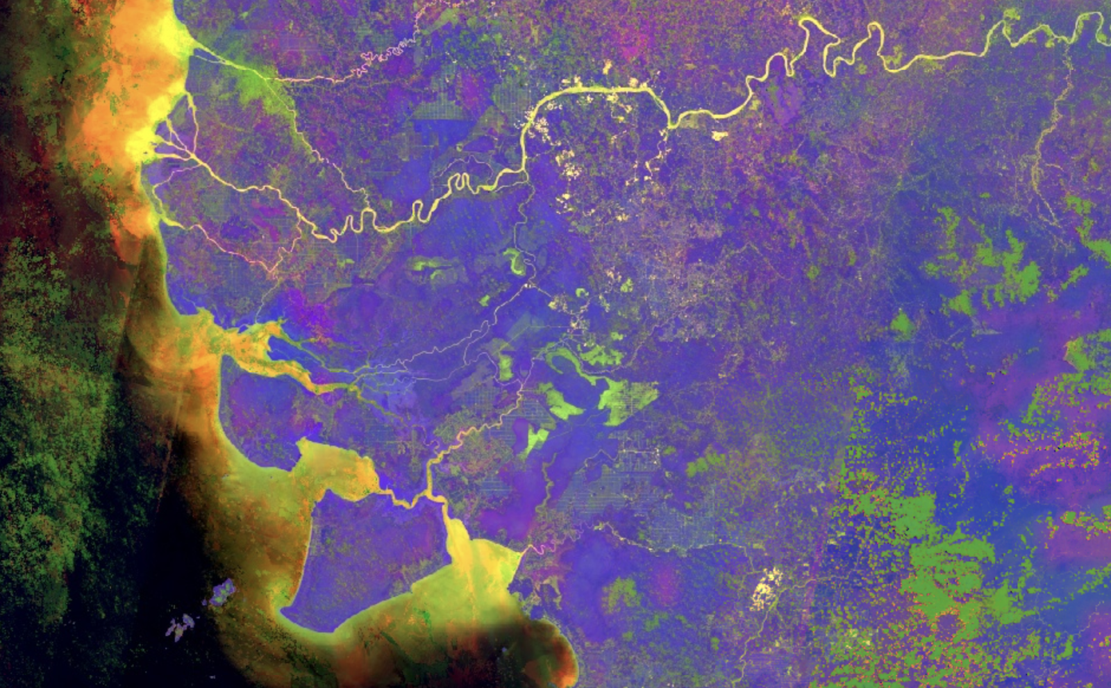
Seeing More With Satellite Imagery Using Band Combinations, Ratios and Indices
Quantifying the Burned Area
The visibly scorched area can be measured using the Area of Interest tool (highlighted below), which allows users to draw a polygon on the map and calculate the total area in square kilometres. (Once drawn, keep the polygon in the editor, as it will be used again later.)

Reportable finding: “The wildfire that swept across Sicily’s Capo San Vito peninsula in 2025 burned more than 50 km2 of the peninsula, according to Sentinel-2 data.”
Repeatedly measuring the burned area over time allows you to follow the progression of a fire. This method was used by Bellingcat when covering the Etosha National Park wildfire in late September 2025.
Extra exercise: Replicate the analysis of the Etosha National Park fire from this Bellingcat article.
Assessing Burn Severity
Some fires only affect surface vegetation, while others scorch the ground and cause long-lasting damage. Burn severity can be measured using an index called the Normalised Burn Ratio (NBR).
How Does the Normalised Burn Ratio (NBR) Detect Burned Areas?
The spectral response of a material describes how reflective it is to different types of light. The graph below shows the difference between healthy vegetation and bare soil in terms of the amount and types of light they reflect.

By focusing on the NIR and SWIR bands, where reflectivity differs significantly between healthy vegetation and bare soil left after a burn, an index can be calculated:
NBR = (NIR – SWIR) / (NIR + SWIR)
A high NBR indicates healthy vegetation, while a low NBR indicates burned areas.
Copernicus Browser doesn’t include a default NBR layer, but it can be added via a custom script, as shown in the screenshot below:
- Select ‘Custom’ in the layer selector.
- Switch from the ‘Composite’ to the ‘Custom’ tab.
- Check ‘Load script from URL’.
- Paste this URL: https://bellingcat-scripts.ams3.cdn.digitaloceanspaces.com/NormalizedBurnRatio.js
- Load the script by clicking the green circular arrows to the right of the URL.
- Click ‘Apply’ (you may need to scroll down).
Alternatively, you can skip these steps and go straight to the custom NBR post-fire image here.

The NBR layer displays positive values in green (healthy vegetation) and negative values in purple (burned areas), making the boundary of the scorched area much clearer than before.
To calculate the change in NBR in Copernicus Browser, use the Statistical Information tool (a free account is required to access this feature).
- Within the date selector, choose a date a few weeks or months after the fire.
- Using the Area of Interest polygon, select the ‘Statistical Info chart’ icon.

- Set the maximum cloud cover to around 30% using the slider in the top right.
- Select a date range that captures the available data surrounding the fire (July 20-27 shown below).
- Identify when the fire occurred on the graph (this will be marked by a sharp drop in the NBR, as shown below).
- Hover over the points on the graph immediately before and after the fire to display the mean value.

In this example, the pre-fire image had an average NBR of 0.11 and the post-fire image had an average NBR of -0.18. The NBR decreased by 0.29, which represents a moderate burn.
| Severity Level | Change in NBR |
| Unburned | Less than 0.100 |
| Low | 0.100 – 0.269 |
| Moderate | 0.270 – 0.659 |
| High | 0.660 or greater |
Reportable finding: In late July, the fire, which scorched more than 50km2 of Sicily’s Capo San Vito peninsula, was deemed moderately severe according to the US Forest Service guidelines.
Extra exercise: Find a custom visualisation script of interest from this repository and explore what it does.
Wildfires in Conservation Areas
By focusing on protected sites such as nature reserves and national parks, we can begin to assess how wildfires affect areas of high conservation value. Controlled burns are widely used in agriculture and land management, but unchecked fires in protected areas risk eroding fragile ecosystems.
The proportion of the Zingaro Nature Reserve that was damaged by the fire can be estimated by combining the NBR image created in Copernicus Browser with a dataset from Protected Planet, a global map of protected areas that includes nature reserves.
QGIS, a program for working with geographic data, is well-suited for this type of analysis. Download and install QGIS on your computer. For help with this step, refer to the QGIS installation guide.
To download the NBR image from Copernicus Browser:
- With the NBR visualisation selected, click the ‘Download’ icon.
- Switch tabs at the top from ‘Basic’ to ‘Analytical’.
- Change the image format to ‘TIFF (32-bit float)’.
- Change the image resolution to ‘HIGH’.
- Change the coordinate system to ‘Popular Web Mercator (EPSG:3857)’.
- Toggle the ‘Clip extra bands’ switch to the off position (see image below).
- Select the ‘Custom’ layer check box (and deselect any others).
- Click ‘Download’.
- Wait. It could take several minutes for the image to be generated and downloaded.

Once the image has downloaded, rename it to NBR.tiff to make it easier to work with.
Next, open QGIS and click ‘New Project’ in the upper left.
Load the image from Copernicus Browser by dragging and dropping the downloaded file into QGIS.
Useful QGIS Terminology
CRS – The Coordinate Reference System describes how the world should be measured and projected. Two of the most common are:
EPSG:4326 – WGS 84, which uses latitude and longitude as the unit of measurement.
EPSG:3857 – WGS 84 / Pseudo-Mercator, which uses metres as the unit of measurement.
Raster – a type of data that uses pixels to represent information (such as satellite imagery)
Vector – a type of data that uses points, lines, and polygons to represent information (such as a burn area polygon).
Processing the NBR Image
Next, we categorise each pixel in the NBR image as burned or unburned.
Previous analysis in Copernicus Browser showed that the Zingaro Nature Reserve’s NBR value dropped below zero only after the fire (before image: mean NBR value on July 20, 0.11; after image: mean NBR value on July 27, -0.18).
We can use this analysis to set a threshold; anything below zero will be categorised as burned.
The QGIS Raster Calculator lets us apply our threshold to the NBR image and create a new layer.
Open the Raster Calculator by selecting ‘Raster > Raster Calculator…’ from the menu bar at the top.

The Raster Calculator lists the raster bands available in the project. In this example, there are five. These bands are set by the custom script we used in Copernicus Browser and are numbered as follows:
- Red
- Green
- Blue
- Pixel validity (not used in this example)
- NBR index
To create a new raster layer that applies our threshold on the NBR index band:
- Double-click the fifth band (ending ‘@5’) to add it to the expression box at the bottom.
- Add < 0 using your keyboard (shown above).
- Select the ‘Create on-the-fly raster instead of writing layer to disk’ checkbox.
- Click ‘OK’.
The expression NBR@5 < 0 tells QGIS to categorise NBR index values as burned if they are less than zero.
The new layer shows burned areas as white (a value of 1), and unburned areas as black (a value of 0).

Extra exercise: Download an NBR image captured before the fire. Use the Raster Calculator to create a new layer that shows burn severity.
Adding Conservation Area Data
Download the Zingaro Nature Reserve dataset from Protected Planet by selecting ‘Download > File Geodatabase’.
As before, drag and drop the downloaded file into QGIS. This time, the download is a zip file and contains many PDF files as well as the geodatabase file of interest. Scroll down to the bottom of the list and select the ‘gdbtable’ file with a polygon icon on the left side (see the blue highlighted row below), then press ‘Add Layers’.

This adds the nature reserve polygon as a layer in QGIS (and gives it an arbitrary colour). The nature reserve is almost completely contained within the white burned area, indicating it was heavily affected by the wildfire.

Quantifying the Burned Area in the Nature Reserve
To measure the proportion of the nature reserve that was burned by the wildfire, we will use the Zonal Histogram tool from the QGIS Processing Toolbox to count the number of unburned and burned pixels within the reserve polygon.
Open the toolbox with ‘Processing > Toolbox’, and a pane should open to the right. In the Processing Toolbox search field, look up ‘Zonal Histogram’ and double-click the result to open the tool.
To create a new layer:
- Set the ‘Raster layer’ to the threshold burn area layer (NBR@5 < 0)
- Set the ‘Vector layer containing zones’ to the nature reserve polygon layer (should start with ‘WDPA_’).
- Click ‘Run’
- Click ‘Close’

This will create a new layer called ‘Output zones’, which is a copy of the nature reserve polygon with pixel counts added.
Select the output layer in the lower left and click ‘Attribute Table’ in the upper right. (The attribute table is a spreadsheet-like view of the data contained in a layer.)
For the output layer, there is just one row because there is only one polygon. If the layer contained many polygons, there would be many rows.
The newly calculated counts are added to the end of the table, so scroll all the way to the right. Look for fields starting with ‘HISTO_’. Here, HISTO_0 is the count of unburned pixels (value of 0), and HISTO_1 is the count of burned pixels (value of 1).

To calculate the proportion of burned area, the number of burned pixels is divided by the total number of pixels.
Proportion = 57413 / (57413 + 2195) = 0.96318…
A value of 0.96318 means that just over 96.3% of the nature reserve burned.
Reportable finding: In late July, more than 95% of the Zingaro Nature Reserve burned in a wildfire, according to Sentinel-2 satellite imagery and Protected Planet data.
Tracking Past Wildfires
To assess the significance of an ongoing wildfire, it is important to place it in historical context. How does it compare with previous fires in the same area? Is it part of a seasonal pattern, or does it represent an unusually severe event?
With coverage dating back to 2008, the European Forest Fire Information System (EFFIS) automatically maps wildfires across Europe, North Africa, and parts of the Middle East.
Fire data can be requested directly from EFFIS using web form, with results delivered by email. For ease, you can also download Bellingcat’s archived copy of EFFIS wildfire data for Italy covering 2015–2025.
For this section, it is best to open a new QGIS project.
To view and analyse historic wildfires in the Zingaro Nature Reserve using EFFIS data:
- (Optional) Add the OpenStreetMap layer from the XYZ Tiles category by double-clicking it.
- Load the EFFIS data into QGIS. If prompted to select a coordinate transformation, click ‘OK’ to accept the default option.
- Load the Protected Planet Zingaro Nature Reserve polygon as described earlier.
- Open the Vector Intersection tool by selecting ‘Vector > Geoprocessing Tools > Intersection…’ from the menu bar at the top.

The Intersection tool creates a new layer containing only the fires that affected the Zingaro Nature Reserve. To create the new layer:
- Set the ‘Input layer’ to the EFFIS fires layer.
- Set the ‘Overlay layer’ to the Zingaro Nature Reserve polygon layer.
- Click ‘Run’.

QGIS functionality can be extended through plugins, including Data Plotly, which adds data visualisation tools. To install Data Plotly, open the Plugin Manager by selecting ‘Plugins > Manage and Install Plugins…’ from the menu bar, then:
- Search for ‘Data Plotly’ in the available list.
- Select the plugin from the search results.
- Click ‘Install Plugin’ to download and install it.

Once installed, open the Data Plotly panel with ‘View > Panels > DataPlotly’. The panel should appear on the right-hand side of the QGIS window.
To plot a graph of historic wildfire activity within the nature reserve, configure Data Plotly as follows:
- For ‘Plot type’, choose ‘Bar Plot’.
- Set the ‘Layer’ to the newly created ‘Intersection’ layer.
- In ‘X field’, type “year(initialdat)”. This expression extracts the year from the fire’s approximate start date, allowing events from the same year to be grouped together.
- In ‘Y field’ enter “$area/1000000”. This expression calculates the burned area within the nature reserve in square kilometres.
Note: EFFIS data provide initial and final dates for each fire, which are approximate because they depend on the availability of satellite imagery. These dates should be treated as bounds for when a fire occurred, rather than as the dates when it started and ended.
Next, switch to the Layout tab in Data Plotly:
- Untick ‘Show Legend’. Only do this for simple plots where a legend is not required.
- Add a title and labels for the X and Y axes.
- Finally, click ‘Create Plot’ and wait a few seconds for the chart to be generated.

The chart shows that the Zingaro Nature Reserve has experienced several significant wildfires over time. However, in 2025, the data show that the fire burned a larger area within the reserve than the major fires recorded in 2020 and 2017.

Reportable finding: The Zingaro Nature Reserve has experienced three major wildfires since 2015. Of these, the 2025 fire burned a larger area within the reserve than those recorded in 2020 and 2017.
The tools and methods in this guide can be applied to wildfires in many other regions. By combining satellite imagery with environmental and historical datasets, it’s possible to move beyond detection and begin to quantify a fire’s impact. In doing so, you can also place individual incidents in context, revealing whether they are part of a recurring pattern or an unusually severe event.
To learn more about fire detection, see Bellingcat’s guide to NASA FIRMS.
To explore QGIS further, visit the Bellingcat toolkit entry on QGIS.
Merel Zoet and Claire Press contributed to this report.
This guide contains modified Copernicus Sentinel data (2025), processed with Copernicus Browser, as well as data from the European Forest Fire Information System (EFFIS) of the European Commission Joint Research Centre.
Bellingcat is a non-profit and the ability to carry out our work is dependent on the kind support of individual donors. If you would like to support our work, you can do so here. You can also subscribe to our Patreon channel here. Subscribe to our Newsletter and follow us on Bluesky here, Instagram here, Reddit here and YouTube here.
Support Bellingcat
Your donations directly contribute to our ability to publish groundbreaking investigations and uncover wrongdoing around the world.
The post Burning Forests: Tools for Tracking and Reporting Wildfire Damage appeared first on bellingcat.
30.06.2026 à 00:34
At least 1,719 people are reported to have died after two devastating earthquakes struck northwestern Venezuela last week. The final casualty count is expected to rise significantly. Some media outlets report resident’s growing frustration with the Venezuelan government and its recovery efforts. Sky News on June 29 reported that the United Nations Coordinator for Humanitarian […]
The post Satellite Imagery Shows Scale of Venezuela Earthquake Damage appeared first on bellingcat.
Texte intégral (1425 mots)
At least 1,719 people are reported to have died after two devastating earthquakes struck northwestern Venezuela last week.
The final casualty count is expected to rise significantly.
Some media outlets report resident’s growing frustration with the Venezuelan government and its recovery efforts.
Sky News on June 29 reported that the United Nations Coordinator for Humanitarian Affairs in Venezuela was preparing for as many as 10,000 deaths.
Social media posts, news reports and drone footage have been shared in recent days, proving vital sources for many Venezuelans (both in the country and living abroad) who are searching for information about loved ones who remain missing.
Social media pages have been set up listing many of those who are yet to be accounted for. Others have contacted Bellingcat asking if apartment blocks relatives were staying in are still standing.
Bellingcat has received satellite imagery from Planet Labs PBC that shows one the worst affected areas in the country, including collapsed buildings and apartment blocks in La Guaira.
Readers can move laterally and vertically to observe the full image in the interactive below as well as zoom in on specific areas to assess the damage. A share button on the top right will copy a shareable link to the zoomed in area.
Scroll and zoom to see damage throughout the affected Venezuelan coast. Toggle between English and Spanish. Share a link to a specific location by clicking the button on the top right. The before imagery is from Jul 30, 2025 and Dec 12, 2023. After imagery is from Jun 27, 2026. SkySat imagery via Planet Labs PBC.
Support Bellingcat
Your donations directly contribute to our ability to publish groundbreaking investigations and uncover wrongdoing around the world.
The high resolution image covers a 14-mile stretch of Venezuela’s northern coast from the towns of Catia La Mar to Caraballeda, which have been among the worst impacted.
Other areas to be significantly impacted but not included in the imagery above include Caracas, Maracay, Valencia, Barquisimeto and Yaracuy.
We have compared the satellite imagery we obtained with previous images captured before the earthquake to identify which parts of this 14-mile stretch of coastline to show changes since the quakes.
Readers can toggle between the imagery captured on June 27 (five days after the Jun. 24 quakes) and a composite of reference images taken on Jul. 30, 2025 and Dec. 11, 2023 (before the quakes).
Zooming in on specific areas reveals the scale of the damage.
For example, several buildings seem to have been flattened in the below before and after images showing the Playa Grande area.


Before imagery (left) of Playa Grande is from Feb 27, 2026. Imagery from after the earthquake (right) is from Jun 26, 2026. SkySat imagery via Planet Labs PBC.
The Planet Labs imagery also confirms significant destruction in the town of Carabelleda.


Before imagery (left) of Carabelleda is from Jun. 19, 2026. Imagery from after the earthquake (right) is from Jun 27, 2026. SkySat imagery via Planet Labs PBC.
Another area, Macuto, has been significantly impacted as well.


Before imagery (left) of Macuto is from Mar 20, 2026. Imagery from after the earthquake (right) is from Jun 27, 2026. SkySat imagery via Planet Labs PBC.
Footage taken on the ground and posted to social media also displays the devastation.
A minute-long video filmed on a 500-meter section of José María España Avenue in Carabelleda shows as many as a dozen collapsed buildings, most of them high-rises. This drone footage gives an aerial look of the destruction of at least six apartment blocks in the same area.
Another video shared on social media showed a collapsed hotel in Macuto, between Carabelleda and La Guaira.
Other open source information about the damage in cities such as Caracas, Valencia and beyond can be found on this site where individuals are uploading images and videos detailing damage.
While international rescuers continue to arrive in Venezuela, the threat of aftershocks remains.
Reuters also reports that engineers fear many buildings that remain standing could be vulnerable and are requesting an audit of state housing.
Carlos Gonzales, Jake Godin and Miguel Ramalho contributed to this report.
Bellingcat is a non-profit and the ability to carry out our work is dependent on the kind support of individual donors. If you would like to support our work, you can do so here. You can also subscribe to our Patreon channel here. Subscribe to our Newsletter and follow us on Bluesky here, Instagram here, Reddit here and YouTube here.
Support Bellingcat
Your donations directly contribute to our ability to publish groundbreaking investigations and uncover wrongdoing around the world.
The post Satellite Imagery Shows Scale of Venezuela Earthquake Damage appeared first on bellingcat.
- GÉNÉRALISTES
- Le Canard Enchaîné
- La Croix
- Le Figaro
- France 24
- France-Culture
- FTVI
- HuffPost
- L'Humanité
- LCP / Senat
- Le Media
- La Tribune
- Time France
- EUROPE ‧ RUSSIE
- Courrier Europe Ctrale
- Desk-Russie
- Euractiv
- Euronews
- Toute l'Europe
- Afrique ‧ Asie ‧ Proche-Orient
- Haaretz
- Info Asie
- Inkyfada
- Jeune Afrique
- Kurdistan au féminin
- L'Orient - Le Jour
- Orient XXI
- Rojava I.C
- INTERNATIONAL
- Courrier International
- Equaltimes
- Global Voices
- Infomigrants
- I.R.I.S
- The New-York Times
- OSINT ‧ INVESTIGATION
- OFF Investigation
- OpenFacto°
- Bellingcat
- Disclose
- G.I.J
- I.C.I.J
- OPINION
- Au Poste
- Cause Commune
- CrimethInc.
- Hors-Serie
- L'Insoumission
- Là-bas si j'y suis
- Les Jours
- LVSL
- Politis
- Quartier Général
- Rapports de force
- Reflets
- Reseau Bastille
- StreetPress
- OBSERVATOIRES
- Armements
- Acrimed
- Conspirationnisme
- Culture
- Curation IA
- Extrême-droite
- Human Rights Watch
- Inégalités
- Justice fiscale
- Liberté de création
- Multinationales
- Situationnisme
- Sondages
- Street-Médics
- Routes de la Soie
- Wokisme